Nine best practices
for creating powerful
packaging designs
Packaging design is not just about standing out from and winning against your competitors on the shelf. Your packaging is also the primary embodiment of your brand. It is an always-on broadcast of your brand that is leveraged across all touchpoints and media. Therefore, it pays to invest time and effort into creating a powerful packaging design.
MetrixLab is a global digital research agency. We have expertise and a strong footprint in packaging design testing. As well as in-house design experts, we have a suite of online behavioral simulation, visual and implicit tools and techniques, such as 3D virtual store technology and eye tracking. We founded our online packaging design testing practice in 2005, and we’ve tested thousands of designs since.
Based on our collective experience and our benchmark database, we’ve pulled together a set of nine best practices for powerful packaging design. These include guidelines on visibility, communication and persuasion:
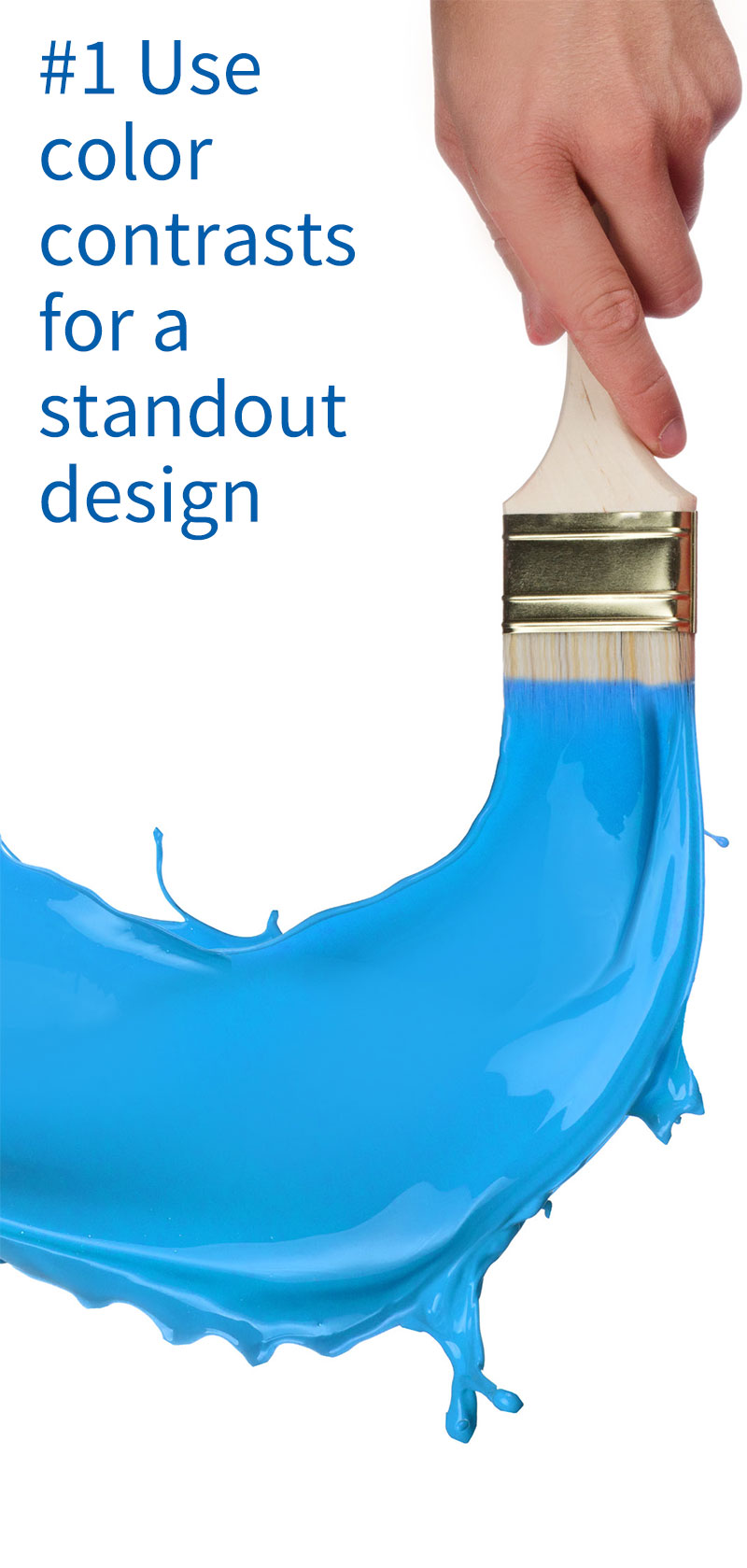
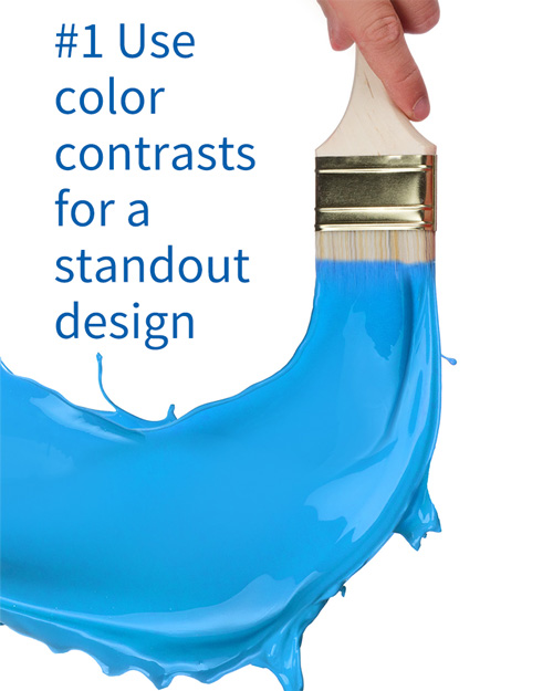
 Visibility: Use color contrasts for a standout design.
 Visibility: Nurture distinctive visual assets.
 Visibility: Unite the line and differentiate the variants.
 Communication: Include all the recipe ingredients.
 Communication: Follow the recipe for a logical flow.
 Communication: Augment your message through congruent elements.
 Communication: Establish the right value perception.
 Persuasion: Create a persuasive design.
 Find a balance between visibility, communication and persuasion.
These guidelines offer a framework to help you create powerful new packaging and self-assess the strength of your current designs. You can also use these guidelines to better inform your design agency briefs.
To get started with optimizing and validating the strength of your current or new packaging designs through market research, contact us at [email protected]
Ensuring strong visibility is the first step in creating a powerful packaging design.
Nothing else in your design matters if it isn’t seen first. A powerful packaging design is clearly visible on the shelf; it stands out from competitor designs.
Choosing a color for your packaging design
One of the easiest and most effective ways to create strong shelf visibility for your design is through color. Select a dominant color for your branding and packaging design which contrasts with category codes and competitor colors.
In the past, a chocolate bar was red for pure, blue for milk, and green for hazelnut chocolate. Then, Milka caused a sensation by using purple packaging. Other brands that have successfully leveraged a contrasting packaging design color include Campbell’s soup (red and white), Tide (orange), and Vanish Oxi Action (pink).
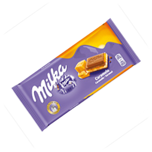
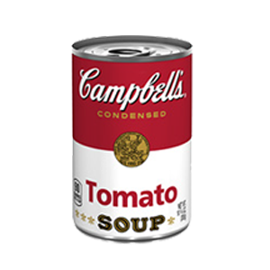
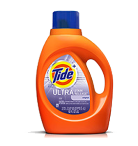
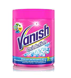
Packaging image source: milka.nl; campbells.com; tide.com; vanish.nl

The challenges of contrasting colors
As always, there is a trade-off and a need to find balance. Going with a disruptive packaging color – that is, a color that breaks with category conventions and commonly held associations – can give you fantastic visibility on the shelf. But, this may not necessarily lead to incremental sales if consumers find the color unappealing. This is a risk that can be managed through a packaging design test.
When choosing a packaging color, findability and not breaking routines is another challenge that you need to manage. More than 90% of packaging design initiatives are ‘restages’, that is, redesigns of an existing product. You want to make sure that your existing customers continue to find their product with ease. You don’t want a redesign to interrupt their flow: their automated search-and-grab routine. Otherwise, if a consumer is made to pause and think, they may use the opportunity to look at what else they could buy instead.

Alongside contrasting colors, a distinctive visual asset offers another way to drive strong visibility for your packaging design. It also speeds up brand recognition and decision-making.
What is a distinctive brand asset?
The concept of creating and leveraging distinctive branded assets is nothing new. The Coca-Cola bottle, Shell’s shell, and Little Debbie are all examples of visual identity elements that have become distinctive brand assets.
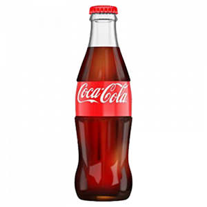

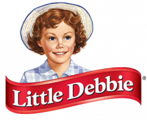
Packaging image source: www.amazon.co.uk; wikipedia.org; littledebbie.com
The distinctive brand asset has resurfaced as a hot topic in recent years on the back of Byron Sharp’s book ‘How Brands Grow’. In his book, Sharp argues that brands should be distinctive, rather than differentiated.
In many categories, brands aren’t very different from one another. Or they are only different on elements that are not as relevant to brand choice. Visual identity elements that are strongly and uniquely associated with a brand will, over time, create distinctive memory structures, which bring the brand top of mind in brand choice situations.
How do you know if your brand’s visual identity elements are distinctive? If consumers strongly and easily associate your asset with your brand, and do not confuse it with any other brand, then you have a distinctive brand asset. This can be researched of course: a simple de-branded speed-of-association test will do the trick.
For many brands, their most – and often their only – distinctive visual asset is their logo. If this is true for your brand, then please love your logo. Nurture it, protect it, and make sure that it has a prominent and sizeable presence on your packaging design.
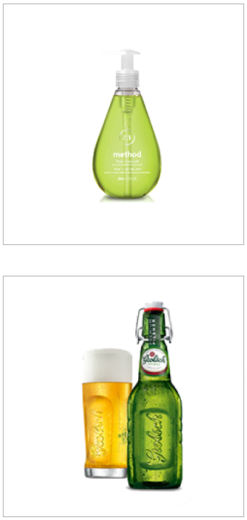
Packaging image source: methodhome.com; grolsch.nl
Creating a brand asset for your packaging design
While it may take a lot of money, time and patience, there is value in developing distinctive assets other than your logo.
Go for brand assets that can be leveraged in both communications and packaging. For example, the M&Ms characters or Planters’ Mr Peanut can be used for both means, whereas George Clooney is only featured in Nespresso communications. Alternatively, a powerful way to create distinctive assets is through differentiated packaging structures, such as Method’s soap bottle, or the Grolsch flip-top bottle.
A final point that you – and your design agency – will have to deal with is the need to find balance. The more space you allocate to a branded visual asset on your packaging design, the less space there is to communicate other key elements, such as the brand, its benefits, the reason-to-believe and the end-promise.
Fitting all the various elements into a design and creating an order that makes sense to people can be a daunting task. But it certainly gives you the opportunity to think creatively!


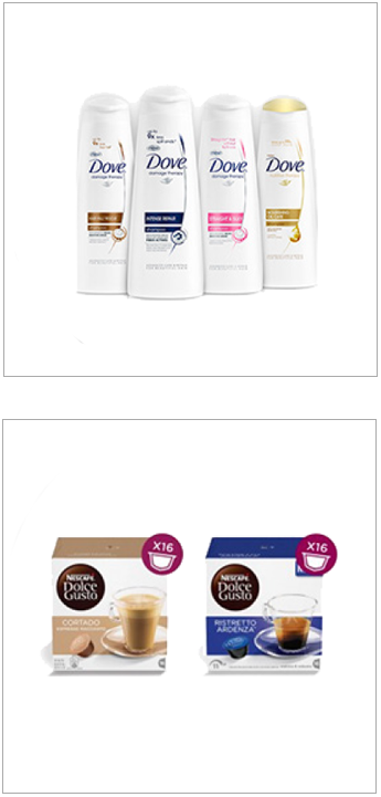
A third element that influences the visibility of your packaging – the first step in creating powerful packaging design – is the balance between line unification and variant differentiation.
This is something you will need to consider if your brand offers a range of products. On the one hand, you want consumers to easily distinguish between your variants. On the other, you want them to quickly recognize that all the variants belong to the same line and brand.
Finding a balance when designing packaging for variants
Like so many of our other packaging design best practices, line unification and variant differentiation is a matter of trade-off and balance. A stronger line unification may take away from variant differentiation, and vice versa.
The benefit of line unification through packaging design is clear. It creates a visual brand block on the shelf that will be hard to miss. You’re communicating that you are a force to be reckoned with, and that is appealing to consumers.
Packaging image source: stylecraze.com; dolce-gusto.com
However, you are offering a line of variants for a reason. Consumers want variation. They want to try something new, and they also have their specific preferences, needs, wants. So, you offer a line of variants, and you introduce new variants on a regular basis. Through your packaging design, you want consumers to easily understand which variants exist, notice new variants as they come out, and find their favorite variants.
In our packaging design practice, we see a lot of designs that are strong in the one, but not the other. They either skew towards a packaging line that has strong visibility, but poor variant findability; or one where consumers can quickly and easily find variants, but at the detriment of brand visibility.
Examples of packaging designs with a unified line – in order to emphasize the brand block – can be found in the personal care aisle, from brands like Dove.
This contrasts with, for example, the Nescafé Dolce Gusto line, where the different variants are easily recognizable through the use of different colors and photography. This works very well for a brand anchored in offering variation.


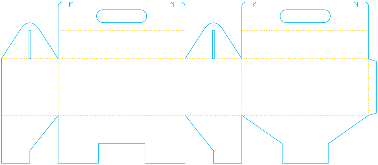
There is no magic formula, set template or proven algorithm for the creation of a powerful packaging design. Fortunately so, we say, or else the world would be a boring place. However, with this guideline, we aim to come as close as possible to offering such a recipe for success.
Now that your packaging design has grabbed the consumer’s attention, its next job is to communicate.
What does it need to communicate? Simple: tell the consumer what your product is and why they should buy it. That’s it. Two questions only that your product packaging design has to answer.
Below, we’ve pulled together a list of all the ‘ingredients’ needed to answer these two questions.

The necessary recipe ingredients for a successful packaging design
How many of these ingredients have you included in your design? Probably not all of them. In fact, in our packaging design testing practice, we rarely see a product packaging that contains the full list of recipe ingredients. We have, however, noticed that designs which feature more of these ingredients tend to perform better.

We have seen a trend over the past years towards simplifying the ‘recipe’. For example, some product packaging designs communicate the promise, but not the benefit or reason-to-believe. The risk with such a minimalist design approach is that the more elements you leave out, the less likely consumers are to ‘get it’.
Minimalist design is great for the iPhone or speaker sets, but we find that packaged goods with a minimalistic design often struggle to effectively communicate to mass audiences. They more typically appeal to a niche audience and/or premium segments.
The power of visualizing the end-promise
We’ve also noticed the benefit of illustrating the end-promise on the packaging. From shampoos promising beauty from shiny hair and skincare products offering eternal youth from radiant skin, to meal kits promising home bliss from a tasty homecooked meal, consumers are more easily persuaded by visual interpretations. Pictures, sketches, or structural shapes and lines offer powerful suggestion and emotional resonance.
Packaging image source: brainjuice.me; thedieline.com
The effective rendering of an emotional end-promise is a particular challenge for the newly emerging class of functional foods. Brain Juice is an example of food packaging that has done this well, by featuring an image of a brain that shines like a lightbulb.
On the other hand, the Maca Sutra product packaging has missed the opportunity to offer a visual interpretation of the powerful promise of sexual health in its design – or perhaps subtlety is what they were going for in this case.


We’ve now established that a packaging design, once it has been noticed, needs to answer two key questions: what is the product? And why should consumers buy it? We then introduced the notion of ‘recipe ingredients’ which answer these questions.
Now that you have your ingredients, the next step towards creating a powerful packaging design is to ‘follow the recipe’. You must arrange your ingredients in a logical layout on your packaging design to create an easy-to-follow flow. The order in which the elements are seen influences understanding, perceptions and, ultimately, persuasion.
Our recipe for packaging design layouts
Brand before product and variant
Function before emotion
Imagine starting with a white box, on which you need to place your elements.

People typically start their ‘visual search pattern’ at a spot about 20% to 30% below the top (the rule of thirds from photography seems to also apply to how people navigate the layout of a packaging design). Therefore, you’ll want to feature your brand logo in this optimal position. Immediately under the logo, you can then state the product category, type and/or variant.
Use the space underneath to communicate the functional benefits, reason(s)-to-believe and an (emotive) end-promise. And consider using the space at the very top for a call-to-action (‘new’, ‘improved’, ‘20% extra’, etc.).
Packaging image source: atom.lk; amazon.co.uk; harveynorman.com.my
Packaging design flow revealed through eye tracking.
What eye tracking reveals time and again is that there is a risk in featuring an emotive picture to visualize the end-promise. The risk is that, depending on the layout, the consumer’s eye could be first drawn to this image, before the elements that communicate the brand, product or functional benefits. This illogical flow may detract from product understanding and persuasion.
Take a look, for example, at the Braun Satin Hair line of three hairdryers. On all three packaging designs, the end-promise is represented by a beautiful woman with fantastic hair. When looking at the 3 and 5-series designs, consumers will look at the hairdryer and its benefits before the woman and what she promises. But, on the 7-series packaging, due to the design layout, consumers look at her before the hairdryer. This may result in sub-optimal sales of the 7-series; which is unfortunate as this hairdryer happens to be the most expensive in the range.
Packaging image source: pantene.com
Let’s also evaluate the flow of the Pantene Pro-V moisturizing shampoo, a market-leading product in the US. Eye tracking reveals the order in which consumers see the different design elements:
- First, shoppers see the brand.
- The ‘shampoo’ mention should come next, but in this case, it has been placed at the bottom. Shoppers typically see this last. This isn’t a problem in shelf situations where the shampoos are clearly separated from the conditioners, but this is not always the case.
- Secondly, shoppers look at the visual representation of one of the two reasons-to-believe (the PRO-V pearl). Ideally, the functional benefit (in this case, the daily moisture renewal) should be seen before the reason-to-believe.
- Shoppers see the second reason-to-believe (the rich lather) after the functional benefit.
- The promise of shiny, rich, beautiful hair, and the end-promise of indulgence are communicated via the shiny, smooth, luxurious texture of the bottle design.

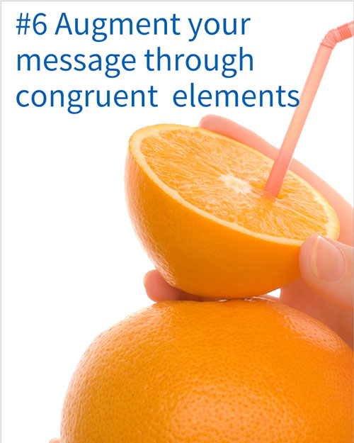
In packaging design, the concept of congruence is defined as two or more design elements relaying the same message. For example, if your design states that it contains 100% orange juice, and features an image of an orange with a straw, we have congruence.
Congruence offers a real opportunity to develop powerful packaging designs. The more your packaging design elements speak the same language, the more powerful your design is going to be. It’s a ‘1+1=3’ effect.
How to create congruence in your design
In our packaging research experience, we often see that the strongest congruence occurs when visual elements (claims, images, icons, choice of colors, etc.) are augmented by structural elements (packaging shape, choice of materials, etc.).
Packaging image source: woolworths.com.au; amazon.com; jilbrooks.com
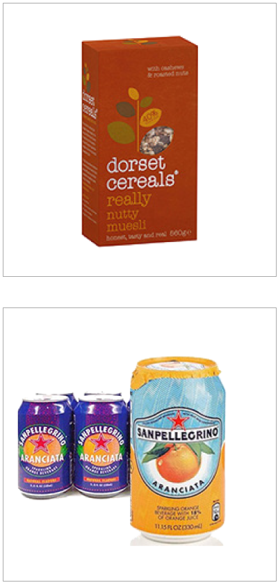
A great example of a packaging design with lots of congruence is the Dorset Cereals box:
The San Pellegrino orange drink can redesign is another example of congruence. The old design was a mismatch of design elements going in all sorts of different directions. The new design effectively communicates orange, premium quality and Italian heritage. The printed foil across the top of the can reinforces those elements, elevating the appeal and persuasiveness of this design.
However, there is a risk factor in reinforcing visual elements with structural design elements in your packaging design. The outcome could lead to incremental environmental waste, exaggerated price perceptions and/or a niche position. We can help you manage those risks and optimize your design with our packaging design testing solutions.


Alongside the price tag on the shelf, your packaging design reinforces your value positioning as an economy, mainstream or premium brand. Your design should therefore be aligned with your price positioning: it should tell the consumer what the product is worth.
The dos and don’ts of adding premium value cues
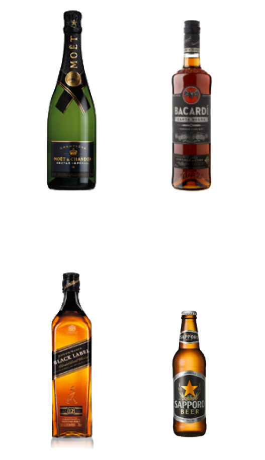
Design cues often used to create premium perceptions on packaging designs include:
Packaging image source: deslijter.com; supermaktaanbiedingen.com; wishbeer.com
Sometimes, we see brands that try to be disruptive by increasing the perceived value of their product through their packaging, but without increasing the actual price or improving the product quality. In the short term, consumers get a sense that they are getting better value for money. However, it can backfire in the longer term as it can confuse and disappoint consumers.
Some design elements that exude premium quality can be cheap to add, such as a gloss finish. But, integrating these into your design could be costly when leading to exaggerated price impressions.
Evaluate the perceived value of your packaging against the competition
It is important to note that the consumer-perceived value generated by a packaging design is relative to the context in which the packaging is placed. In a store or other environment, where a product is seen alongside competitor products, the price perception is in part driven by the strength of the competing designs.

You should therefore regularly check the general health and value perception of your designs against changes in consumer tastes and in the competition. You will then recognize when the time has come to revisit and refresh your packaging design.
MetrixLab’s price-distance perception meter
As part of our market research solutions, we have developed a test to quantify the price-distance perception of your packaging design relative to the competition. Participants drag and drop your packaging and competing designs on a line that runs from ‘low price’ to ‘high price’. In this way, we can check the perceived value of your design against those of competitor brands. By overlaying actual in-market prices in the analysis stage, we can also establish whether your design is perceived as over or under priced.


Your product may already follow all our guidelines on powerful visibility and communication. But, ultimately, a packaging design needs to persuade consumers to buy your product.
Persuade through a balance of category and brand-specific drivers
The key to making your packaging design persuasive is to find a proper balance between communicating category benefits and distinctive brand benefits.
For example, a shampoo bottle might convey that it cleans hair (category benefit), plus that it makes your hair, and by extension your personality, shine (explicit and implicit brand benefits). A bottle of water could communicate that it quenches thirst (category benefit), plus that it will turn your ordinary meal into a passionate Italian love affair (implicit brand benefit).
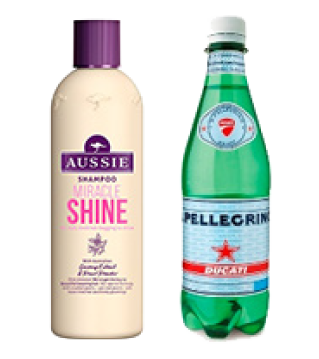
The most persuasive packaging designs have found just the right balance between category drivers and distinctive brand-choice drivers.
Packaging image source: aussiehair.com; nestle-waters.com
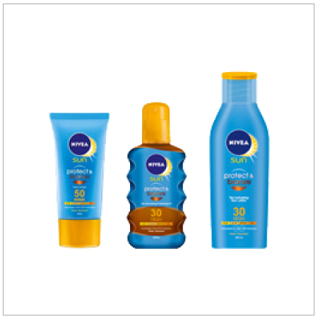
Packaging image source: nivea.co.uk
It is difficult to pin point exactly what motivates consumers’ brand choices. Consumers themselves are generally not able to rationalize or articulate the brand choice they make. This is because brand choice is often driven by subconscious and emotional motivations.
For example, consumers were asked directly why they preferred a specific brand of sunscreen. Answers included because of the ‘immediate, effective protection’ and ‘being able to enjoy the sun without worry’. But these are only generic category
benefits: all sunscreen brands deliver against these needs. You shouldn’t ignore the need to communicate category benefits on your packaging design, but they will not make the difference to the brand choice.
Instead, the way to persuade consumers to choose your product over the competition is to balance communication of the category benefit with a secondary benefit that is distinctive to your brand. In the sunscreen category, ‘it promotes a bronze colorization’ and ‘trustworthiness’ are some examples of distinctive brand choices.
The Nivea Protect & Bronze design offers a particularly good balance in this category. The sunscreen bottle design strongly communicates both a category benefit (‘protect’) and a distinctive secondary benefit (‘bronze’).

Add a persuasive call-to-action on your packaging design
Another element that is often used to persuade consumers to buy is an on-pack call-to-action. A bold statement telling the consumer it’s a ‘new formula’ or offering ‘8 + 2 free cans’ might give the final push.
In our packaging design market research experience, we have evidence to suggest that these types of claims tend to have impact. However, the impact varies depending on the product’s category and the specific statement or offer.


We have now established that a packaging design needs to grab consumers’ attention, communicate the ‘what and why’, and persuade them to buy. The challenge is that these three roles can be conflicting.
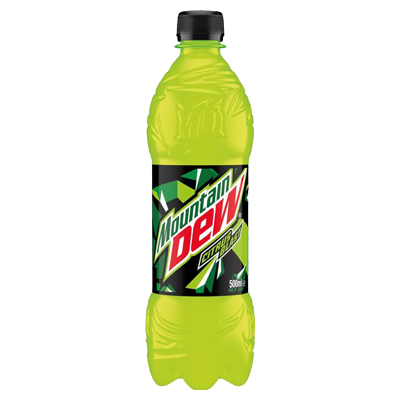
In our experience of testing packaging designs, we frequently come across designs that excel in one of these three roles, but at the detriment of the other two roles.
For example, a product like Mountain Dew has fantastic visibility, especially its PET bottles, courtesy of its neon-yellow-green color. However, it is exactly this element which puts consumers off trying the brand.
You might also want to use photography on your packaging to catch the consumer’s eye, for example a photo showing your product in use. However, this can take away from ease and speed of brand recognition and persuasion.
Unfortunately, there is no magic formula to help you create a well-balanced packaging design with powerful visibility, communication and persuasion. So, this is where creativity and art meet science and data.
Packaging image source: groceries.morrisons.com

There are two things that can help you increase your chances of creating a well‑balanced design:
Author

Alexander Kleijngeld
Senior Global Knowledge
& Innovation Consultant
Test your packaging design with MetrixLab’s research solutions
Through our PACT suite of research solutions, we can help you create, optimize and validate the strength of your packaging designs. For information on our solutions and for more advice on creating powerful packaging designs, we’re just an email away.
Contact one of our expertsAbout MetrixLab
MetrixLab is a fast-growing global market research and insights company that’s challenging the status quo of insights. By blending evolving technology with passionate experts, MetrixLab helps global and local brands to drive more impact, and forges partnerships to drive sustainably equitable growth. From creative testing to brand tracking, and packaging to e-commerce optimization, MetrixLab’s range of solution suites adapts to fit all types of budgets, timelines and business needs.
Active in more than 90 countries, MetrixLab is a proud partner to more than half of the world’s top 100 brands and part of the Macromill Group.
© Perfectly Possible Designs
