Case study
Evaluating the packaging design performances of seltzer brands using AI packaging testing
Business challenge
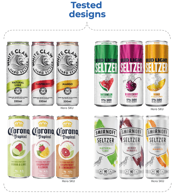
It’s hard to escape the latest alcoholic beverage craze in the industry these days: hard seltzer. The global hard seltzer market was valued at USD 8.95 billion in 2021 and is set to expand rapidly from here on out. Part of the reason why seltzer is so popular is that it checks off a lot of the boxes for health-conscious consumers. They can be gluten-free, low-calorie, lowsugar, low-carb, and low-alcohol. Whether it’s the wildly popular White Claw, seltzers launched by mainstream beer brands like Bud Light and Corona, or by vodka brands like Smirnoff. One thing is clear, the hard seltzer market is on its way up, with no plans of slowing down anytime soon.
Upon looking at the brands present in this market and how they manifest themselves through their packaging designs, we couldn’t help but notice a significant level of design uniformity. This ‘me-too’ design approach makes sense in rapidly growing novel markets. However, as the market matures, designs need to become more distinct to maintain market share.
This realization motivated our team at MetrixLab to:
- 1. Look at the pack designs of a selection of the most popular seltzer brands to determine how strong and distinctive the designs already are today, and which specific design elements drive their strength.
- 2. Provide recommendations to all the brands active in the seltzer category on how to create more powerful and distinctive pack designs that can stabilize or grow these brands when the seltzer market starts to mature.
Our approach
We conducted a study on the seltzer design landscape using our PACT INSTANT solution, which leverages an intelligent combination of AI predictive algorithms and human expertise to evaluate packaging designs.
Our AI packaging solution evaluates designs through a validated framework of nine best practices for the creation of more powerful packaging design: contrast, distinctiveness, brand/variant balance, presence, hierarchy, aesthetics, price positioning, benefits/claims, and overall balance between visibility, persuasiveness, and communication.
We used this combination of multiple AI algorithms and well-guided human design expertise to assess the strengths and weaknesses of four popular mainstream seltzer packaging designs.

Results
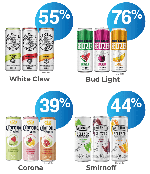
The Bud Light Seltzer design is the strongest of the four seltzer designs that we looked at in the test. It has the highest shelf visibility potential, is most distinctive, has a good design element hierarchy, clear messaging, design cues, and architecture that make it appealing. Bud Light Seltzer’s projected shelf visibility potential is the highest of the four designs at 76%.
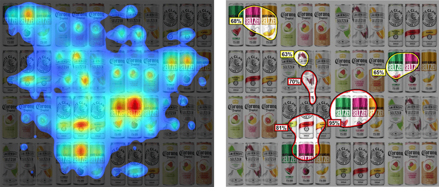
Bud Light Seltzer’s bright saturated colored block is the standout feature which gives it the highest shelf visibility potential. White Claw has the second highest shelf visibility potential, ahead of Smirnoff and Corona. The heatmaps reveal the design elements that will attract the eye first, most of them belonging to the Bud Light design.


Coming to the design aesthetics, we see that the Bud Light Seltzer design is also the prettiest of them all, which can be attributed to the great clarity and balance that comes from its clean, harmonious, and symmetrical design.
The Corona and White Claw designs are also aesthetically pleasing, with both designs being clear and well-balanced. The Smirnoff design aesthetics are only average. It falls short in symmetry which disrupts the balance of its design. Visually, it is also the most complex and cluttered design with a large number of design elements.
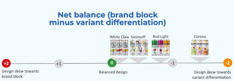
Overall, the White Claw and Smirnoff designs are very well-balanced, both grounded in having a white background with large logos and an understated usage of colors for variant indication. The Corona design, however, skews towards communicating the different variant flavors. Even though it may lead to better communication of flavor benefits and broader purchase repertoires, this skew may make it harder for Corona to create a strong brand block towards higher on-shelf visibility.

None of the four designs are overtly premium. Given the seltzers’ premium prices, it makes sense to feature element(s) that signal premium but not so many as to take away from accessibility. The Bud Light, Corona, and Smirnoff Seltzer designs find this balance between accessibility and a premium feel, each featuring one or two understated premium design elements. Unfortunately, the White Claw design is at a disadvantage as its no-frills design lacks any premium cues.
Based on our findings, we recommend that the Bud Light Seltzer continue to leverage its powerful design without any changes. The White Claw design is most in need of a design overhaul. And while the Corona and Smirnoff designs are average performers throughout, a few minor visual alterations may help these brands create better-balanced designs with a higher shelf visibility potential.
However, this case study isn’t where the story ends. It’s just the tip of the iceberg. Our team has more actionable insights that can help your brand create bigger business impact. To find out more, check out our solutions page for more information on our AI packaging solutions or reach out to us here.

