Case study
Disruptive packaging design repositions and grows Amstel Bock beer

Business challenge
One of the few true Dutch traditions is Bock beer, a seasonal specialty beer with an emphatic connection with autumn. It is synonymous with and only available in the colder, more cozy months. Most Bocks are strong, dark, and slightly sticky from the malt sugars while also being mildly bitter. Bock beer is very popular in the Netherlands and brewers often add their own twist to distinguish themselves from the crowd. Among the many mainstream and specialty bock beers is the Amstel Bock beer brand.
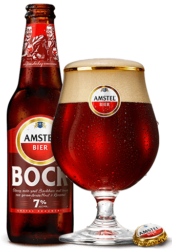
Amstel was looking to drive market penetration for its bock beer, Amstel Bock. For this purpose, they designed a new, disruptive packaging for Amstel Bock.

Amstel wanted the new bock beer packaging design to convey notions of quality, authenticity, and friendship. It was also an important goal for the company to retain existing Amstel Bock consumers.
Our approach
After a thorough understanding of Amstel’s needs and goals, we tested the new Amstel Bock package design using our COMPACT design validation solution. COMPACT is a packaging design test that includes two behavioral simulation modules in a virtual shelf and other System-1 type modules while also being fast and affordable. This solution looks at the key drivers of powerful packaging designs. These are shelf stand-out and shelf findability, distinctiveness, attraction, benefit perception, and the expected impact from a design change on sales penetration.
The main purpose of this study was to test the new Amstel design to see whether:
- 1. It could increase penetration while retaining existing customers.
- 2. It could improve quality perceptions of the brand itself.
For benchmarking purposes, we also tested the current design and two competitor designs.
Results
Our tests showed that the new, disruptive design outperformed the current bock beer packaging design. Our findings revealed that:
- 1. The new package design offered a more effective balance between brand (Amstel) and product (bock beer) cues.
- 2. Both existing Amstel Bock buyers and non-buyers felt that the new design was more appealing and distinctive. They also perceived it to be more premium.
- 3. The visual representation of the Amstel founders on the new packaging emphasized that the beer was designed for ‘special moments’ and ‘bringing friends together’.
Based on our findings, we also put forward multiple recommendations for improving the new Amstel Bock design. These included:
- 1. Removing the ‘No.04’ indication
- 2. Making the background color brighter
- 3. Making the product description sharper