Alongside the price tag on the shelf, your packaging design reinforces your value positioning as an economy, mainstream or premium brand. Your design should therefore be aligned with your price positioning: it should tell the consumer what the product is worth.
The dos and don’ts of adding premium value cues
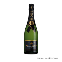
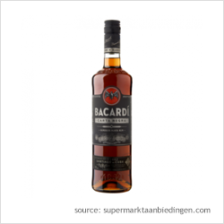
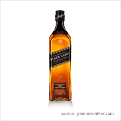
Design cues often used to create premium perceptions on packaging designs include:
- Dark colors such as purple and black
- Differentiated packaging structures and shapes
- Embossing
- Quality seals
- Heritage claims
- Metallic colors including gold, silver, bronze and platinum
- Gloss
Sometimes, we see brands that try to be disruptive by increasing the perceived value of their product through their packaging, but without increasing the actual price or improving the product quality. In the short term, consumers get a sense that they are getting great value for money. However, it can backfire in the longer term as it can confuse and disappoint consumers.
Some design elements that exude premium quality can be cheap to add, such as a gloss finish. But, integrating these into your design could be costly when leading to exaggerated price impressions.
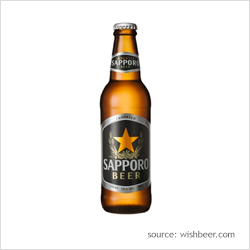
Evaluate the perceived value of your packaging against the competition
It is important to note that the consumer-perceived value generated by a packaging design is relative to the context in which the packaging is placed. In a store or other environment, where a product is seen alongside competitor products, the price perception is in part driven by the strength of the competing designs.
You should therefore regularly check the general health and value perception of your designs against changes in consumer taste and the competition. This will prevent the power of your designs from weakening over time.
MetrixLab’s price-distance perception meter
As part of our PACT market research solutions, we have developed a test to quantify the price-distance perception of your packaging design relative to the competition.
Participants drag and drop your packaging and competing designs on a line that runs from ‘low price’ to ‘high price’. In this way, we can check the perceived value of your design against those of competitor brands. By overlaying actual in-market prices in the analysis stage, we can also establish whether your design is perceived as over or under priced.
More resources for creating powerful packaging designs
Download our whitepaper below for our nine guidelines to creating your own packaging design. You can also find out more about optimizing your packaging through a unified product line, persuasive benefits and a well-balanced design in our packaging design blogposts.
To get started with optimizing and validating the strength of your product packaging design through market research, contact us.
