The PACT series part 1:
Investing in distinctive packaging structure
At MetrixLab, we’ve been testing packaging design for over 10 years. Needless to say, we’ve built a wealth of experience and developed a robust database to help brands create impactful packaging.
So, what exactly does it take to design packaging that stands out and wins over customers?
There is no one-and-done answer to this question. Which is why we’ve launched the PACT series: a collection of blog posts that dive into the principles and best practices of effective packaging design. In the first blog post of the series, we’re exploring the how and why of investing in distinctive packaging structure. Let’s dive in.
Why does packaging structure matter?
Having a distinctive packaging structure can offer a variety of benefits over standardized packaging structures. When done right, the benefits of going to market with non-standard packaging structure can outweigh the downside of its incremental costs.
There are many benefits a differentiated packaging structure can offer:
It may help increase on-shelf visibility, which is the most direct path towards growing sales.
It may help to facilitate on-shelf findability, making it easier for repeat customers to buy your product.
It can contribute to an overall more aesthetically pleasing pack, which has been proven to be a key driver of powerful packaging design.
It may elevate premium perceptions of your product, and with that comes the ability to command a premium price.
It can work to (implicitly) reinforce a key message like a product feature or benefit, thus creating a design that works both above and beneath the surface – consciously and subconsciously.
Case in point: Toblerone
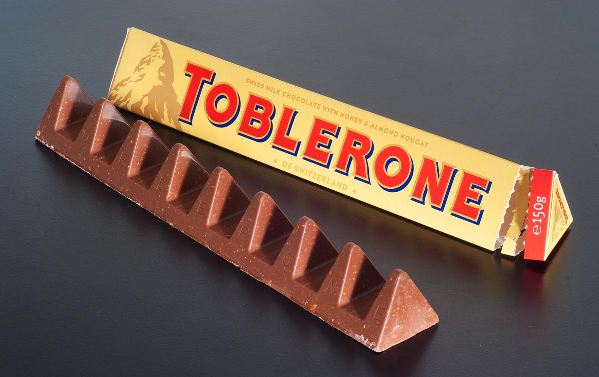
A great example of a differentiated packaging structure that improves visibility is Toblerone’s packaging. Apart from the delicious taste of their milk chocolate bars, Toblerone’s long-term success can be attributed to its iconic prism shaped packaging.
This shape implicitly mimics the brand’s mountainous logo, which reinforces the message of the brand’s Swiss heritage. In addition, the shape stands out from the rectangular shape of most other chocolate bars. Not only is this shape difficult to imitate, but it also helps elevate premium perceptions.
Needless to say, Toblerone’s chocolate bars are instantly recognizable, and their prism shape has become a distinctive visual brand asset.
Communicate the benefits of your product with packaging structure
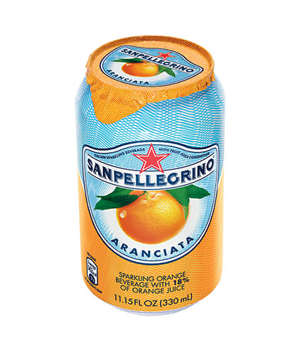
Source: getynet.com
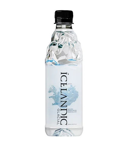
Source: walmart.com
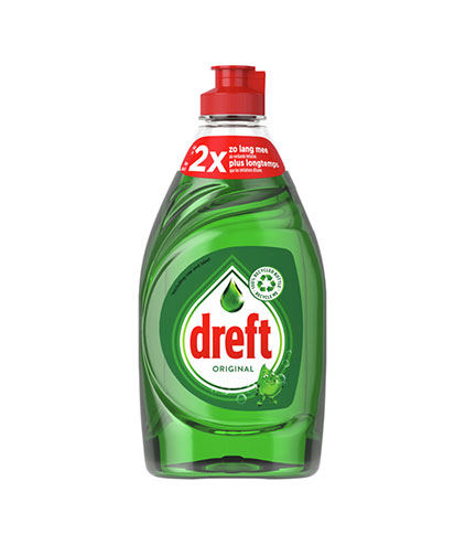
Source: ah.nl
The creation of a distinctive packaging structure can be a fruitful investment when done right. Additional costs may be offset by the multiple benefits it brings to your brand. Your pack structure is an opportunity to visualize your brand promise. Don’t be afraid to think out of the box – literally!

